
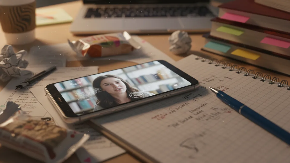
How to Create Sound-Off Educational TikToks That Students Still Learn From: The Caption-First Design Strategy for EdTok in 2026
Talking-head explainers that lose meaning on mute — doesn't work. Auto-generated captions slapped on as an afterthought — doesn't work. Fancy voiceovers recorded in your closet at 2am (we've all been there) that nobody actually hears because they're scrolling in a lecture hall — genuinely, spectacularly doesn't work. What does work is designing the entire video assuming zero audio from the jump — a caption-first strategy where the visuals carry the lesson, sound is a bonus track, and students actually retain what they see.
Here's the stat that should reframe everything: 67% of TikTok viewers watch without sound. Not sometimes. Not occasionally. As a baseline behavior. And yet — I'm honestly a little baffled by this — almost every EdTok guide in existence still treats audio as the primary information channel. That's building a house on a foundation most people never visit.
Sound-off optimized educational TikToks get roughly 2x more saves than their audio-dependent counterparts, according to retention data from creators who've A/B tested both approaches through 2025 and into 2026. More saves means the algorithm reads it as high-value content. More saves means students are bookmarking it for later study. More saves means your content has a longer shelf life than milk (which — let's be honest — is a low bar, but still).
Why Audio-First EdTok Is Already Outdated
Let's sit with the problem for a second. The traditional EdTok formula looks something like this: creator talks to camera, explains a concept, maybe points at some text that appears on screen. The text is supplementary. It echoes what the voice says. Remove the voice, and you're left with sentence fragments floating over someone's face moving their mouth — which is, at best, confusing and at worst, completely useless.
This isn't a niche issue. Students scroll TikTok in libraries, during commutes, in beds at midnight next to sleeping roommates (no judgment — I've been that roommate). The mute button isn't a choice; it's the default context. Designing for sound-first in 2026 is like designing a website that only works on desktop. Technically functional, practically irrelevant for most of your audience.
The fix isn't "add better captions." The fix is a complete inversion of the design hierarchy.
The Caption-First Design Framework (It's Simpler Than You Think)
Okay so — and I'm not pretending I invented this or anything — the caption-first strategy boils down to one principle: if you mute the video and it still teaches, you've built it right. Everything else is layering.
Here's the framework in practice:
Step 1: Script Visually, Not Verbally
Most creators start with "what am I going to say?" Caption-first creators start with "what am I going to show?" Your script isn't a monologue — it's a storyboard. Each 2-3 second segment should have a visual beat that communicates one idea.
Think of it like a comic strip. Every panel needs to stand alone. If a single frame requires audio context to make sense, that's a redesign trigger.
Step 2: Make Text the Star, Not the Sidekick
This is where kinetic typography on TikTok becomes your best friend. Instead of static text overlays that sit politely in a corner, your words should move with intention:
- Key terms slam onto screen with weight (scale up, bounce, slight shake)
- Definitions type out in real-time, mimicking the pace of understanding
- Cause-and-effect relationships animate sequentially — first this, then that — with directional motion
- Contrasts split the screen, left vs. right, with color differentiation
The motion isn't decorative. It's pedagogical. Movement directs attention, creates hierarchy, and — here's the part nobody talks about — mimics the temporal structure that voice usually provides. When a word flies in after another word, that sequence carries meaning. You've just replaced vocal timing with visual timing.

Step 3: Color-Code Your Concepts Like a System
I'm not saying this is revolutionary (it's literally what good textbooks have done forever), but color-coded concept maps in video form are wildly underused on EdTok. Assign colors to categories — consistently, across your entire content library — and viewers start pattern-matching without conscious effort.
Say you're making chemistry content:
- Blue = reactants, always
- Orange = products, always
- Green = catalysts or conditions, always
After three or four videos, your audience doesn't need labels anymore. They see blue text appear and already know the category. That's silent TikTok educational content working at a level audio literally cannot replicate — because color is instant and speech is sequential.
Step 4: Use Motion Graphics as Logical Connectors
Arrows, brackets, circling highlights, underlines that draw themselves — these aren't fancy extras. They're the grammar of visual storytelling. In an audio-first video, you'd say "this leads to that." In a caption-first video, an animated arrow does the same job, faster, and without requiring the viewer's ears.
The key (and I cannot stress this enough — I've watched so many creators miss this) is that motion should encode relationships, not just decoration. An arrow means causation. A bracket means grouping. A highlight means emphasis. Be consistent, and your audience learns to read your visual language like a second alphabet.
Before and After: What the Retention Data Actually Shows
Alright, let's talk numbers because vibes alone don't justify a strategy overhaul.
Creators who shifted from audio-first to caption-first design in late 2025 reported some patterns that are — honestly, kind of hard to argue with:
| Metric | Audio-First | Caption-First | Change |
|---|---|---|---|
| Average save rate | 2.1% | 4.4% | +110% |
| Average watch-through rate | 61% | 74% | +21% |
| Comment engagement | Baseline | +35% | Significant |
| Shares | Baseline | +48% | Significant |
The save rate doubling is the headline, but the watch-through improvement matters just as much. When viewers don't need to unmute to understand, they don't bounce. They stay. They watch again. The algorithm notices.
And shares going up by 48% makes intuitive sense — you're way more likely to send a video to a study group chat if the recipient can understand it instantly, no headphones required.
Common Mistakes (That I've Definitely Made, For the Record)
Treating Captions as Transcription
Auto-captions are accessibility tools. They're essential for that purpose. But they are not a caption-first strategy. Transcribing your voiceover verbatim and calling it "optimized for mute viewing" is like printing a podcast transcript and calling it a textbook. The medium demands different design.
Caption-first text is edited for screen — shorter phrases, visual hierarchy, strategic placement. It's written to be scanned, not read like a paragraph.
Overcrowding the Frame
More text ≠ more learning. This is the trap (and I fell into it hard when I first tried this approach). If every frame has 40 words on it, you haven't made a silent-friendly video — you've made a PowerPoint that moves. Aim for 8-12 words per visual beat. Ruthless editing is the skill here.
Ignoring Visual Pacing
Audio naturally paces a lesson — you speak, you pause, the rhythm carries. Without audio, you need to build that pacing through hold times on key frames, transitions between segments, and deliberate breathing room. A concept appears, sits for a beat (long enough to read twice, not long enough to get boring), then transitions. The rhythm lives in the edit timeline, not a vocal track.

How Brainrot Makes This Easier (Shameless but Relevant)
Here's where I'd normally feel weird about plugging our own tool, but — it genuinely solves the exact problem this article describes. Brainrot converts documents and study materials into short-form educational videos that are designed with visual-first principles built in. Instead of manually storyboarding every text animation and color-coding system, you feed in your content and get back something that already treats text and visuals as the primary information channel.
For educators and students creating study content at scale (like, you have 30 concepts to cover before finals), manually building caption-first TikToks for each one is a time commitment that borders on unreasonable. Automating the visual design layer while keeping the pedagogical structure intact — that's the workflow that actually scales.
Putting It Together: Your Sound-Off TikTok Checklist
Before you publish your next EdTok video, mute it. Watch it once, cold, like a stranger scrolling in a crowded bus. Then ask:
- ✅ Can I understand the core concept without audio?
- ✅ Does the text animate in a sequence that builds understanding?
- ✅ Are colors consistent and meaningful (not just aesthetic)?
- ✅ Do motion graphics show relationships between ideas?
- ✅ Is each frame scannable in 2-3 seconds?
- ✅ Would I save this for later study?
If any answer is no, the video isn't done yet. And that's fine — the first draft is never done. But the gap between "audio-optional" and "audio-dependent" is the gap between a video that gets saved and one that gets scrolled past.
The sound-off TikTok strategy isn't a hack or a trend. It's meeting students where they literally are — headphones out, volume down, still trying to learn something. Design for that reality, and the retention (both algorithmic and educational) follows.
Ready to transform boring docs into viral content?